
COVEY – cart flow
Level up Your Skincare
SEC.01 (CASE STUDY — THE ABSORPTION COMPANY)
© LSG
40.7375, -73.9919 / 40.7608, -111.8886
COVEY – cart flow
Health & WellnessA/B Testing improvements to bottle-neck areas of the site to increase conversion
SEC.02 (RESULTS)
© LSG
40.7375, -73.9919 / 40.7608, -111.8886
LIFT IN CVR
DATE RANGE: 6/27/23 – 7/12/23
LIFT IN REVENUE
DATE RANGE: 6/27/23 – 7/12/23
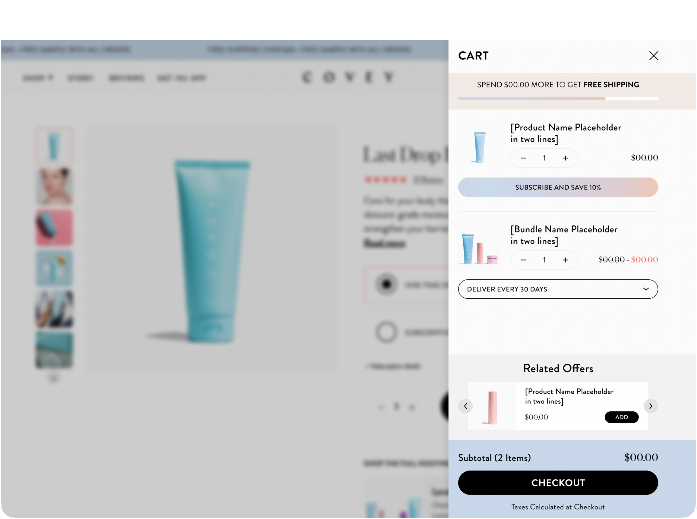
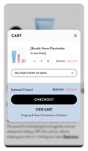
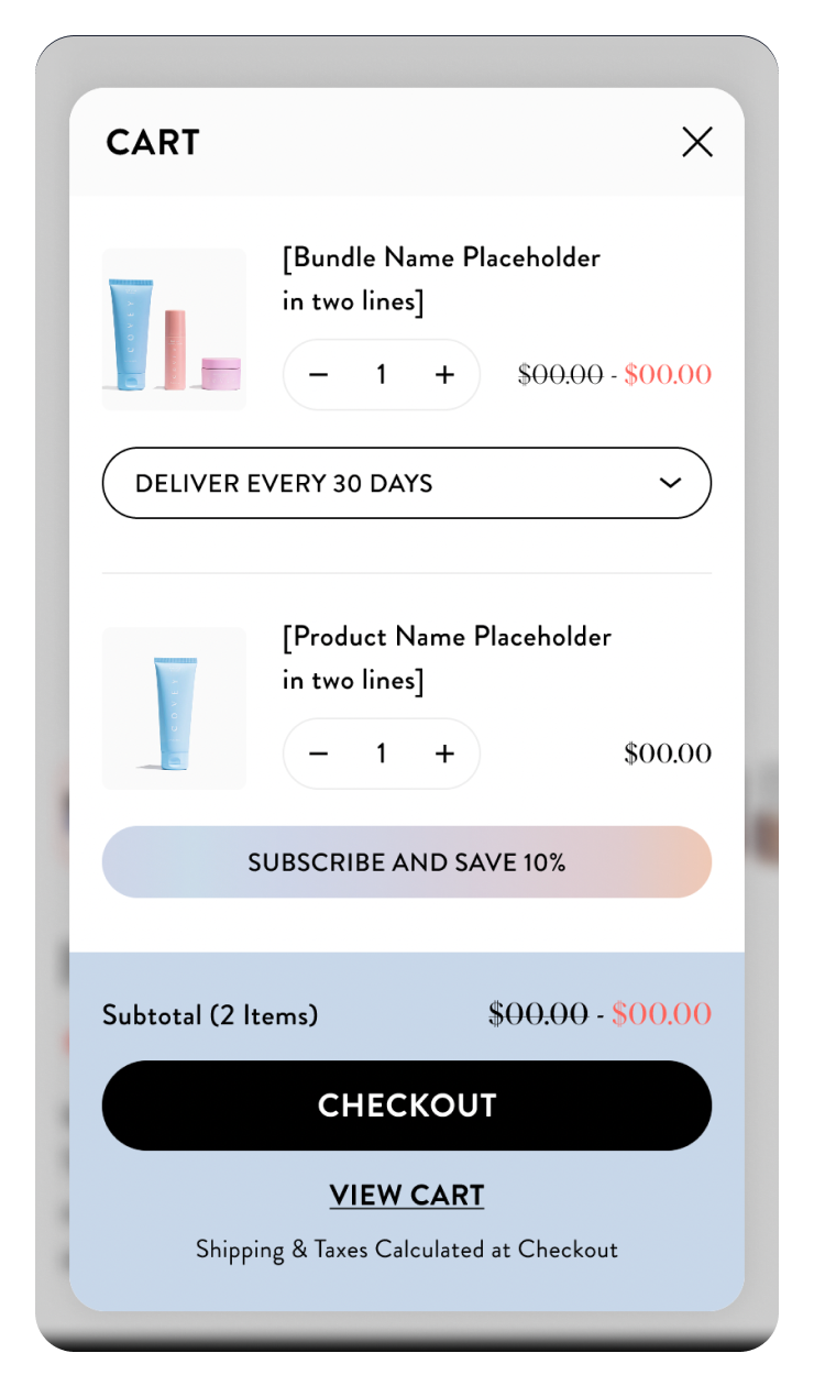
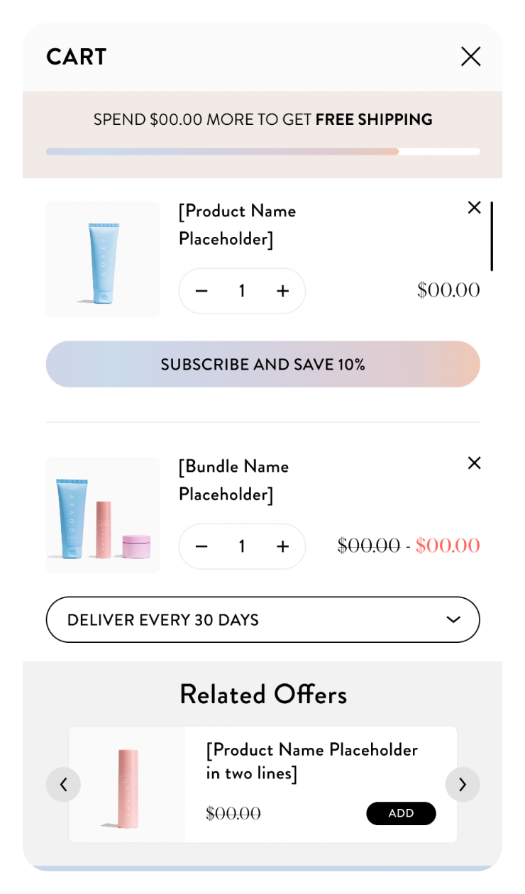
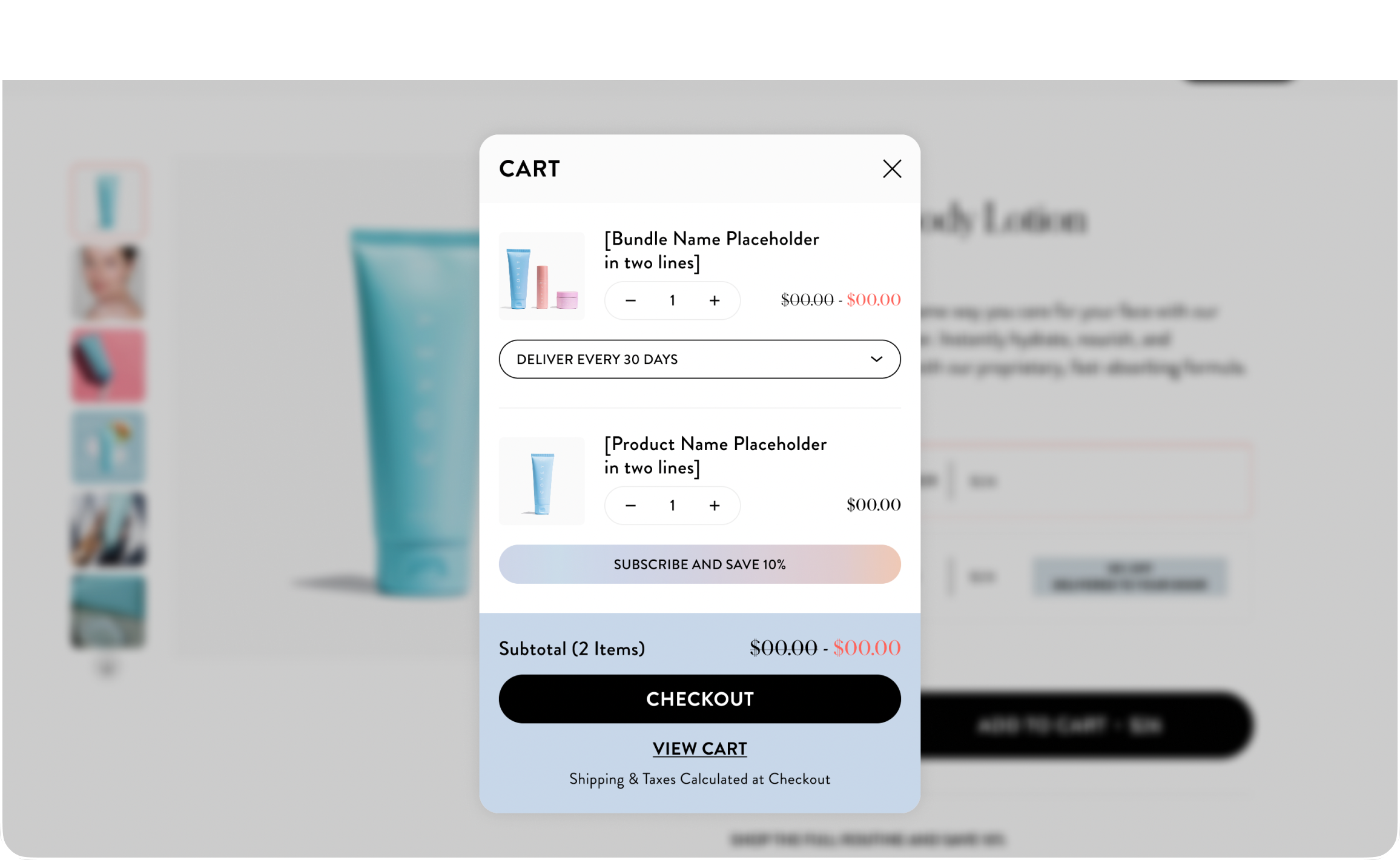
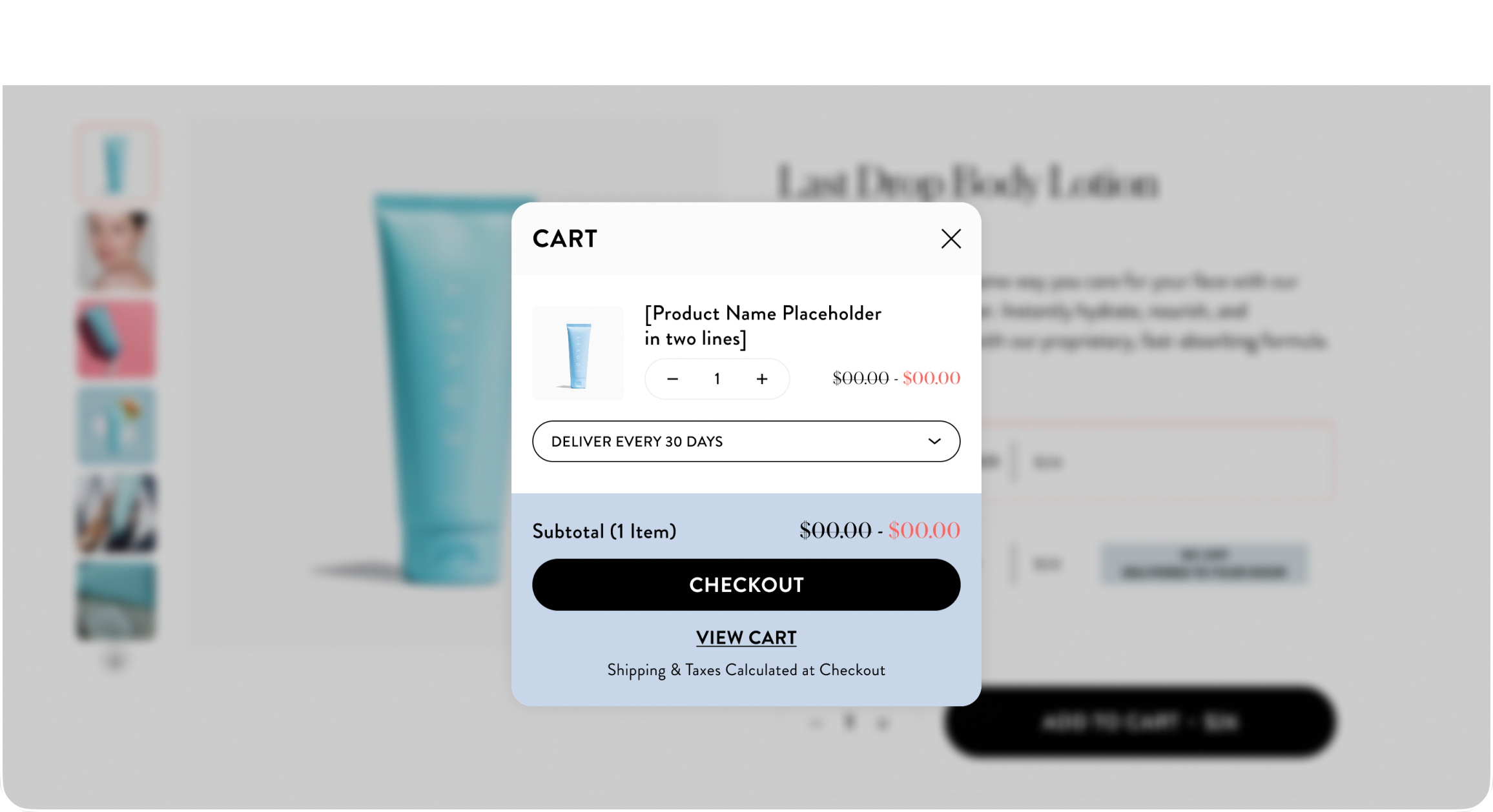
Covey was experiencing above-average cart abandonment. There were a number of pain points in the cart that we identified that were likely preventing visitors from converting. We designed a new cart drawer, based on best practices from dozens of carts we’ve tested on ecommerce stores. We tested a new cart drawer that emphasized checkout.

CONVERSION DESIGN
Not all carts are created equal. What looks the best may not convert the best. For Covey, we wanted to create a cart experience with a specific, conversion-focused design hierarchy. The CTA is the most prominent element in the cart, followed by the subscription upsell, then the related-offer upsells.
